Colors of the Filipino and U.S. Flags

If you’re Filipino American, the colors red, blue, and gold probably mean something to you. That’s right: They’re the colors of the Filipino flag!
To honor Filipino American History Month (FAHM or Fil-Am Month), we’re going to explore the meaning behind the colors of the flag of the Philippines. We’ll also compare it to the colors of the flag of the United States.
But first, let’s talk about flag design in general. Since childhood, the flag of the Philippines has been my favorite. I would wave a little Filipino flag while humming along to the Philippine national anthem on my dad’s PC in the Southside of Chicago. (I highly recommend giving the anthem a listen. It is one of the jolliest and uplifting anthems you’ll ever hear.) And, it certainly helps that the Filipino flag is well-designed with clean color ways, balanced elements, and dynamic composition.
National flags are terrific examples of the most stringent design assignments. To me, they are one of the highest pinnacles of design demands, right up there with logo design. Can you imagine the pressure? From form to color, every element on a flag is tasked with the heavy lifting of representing an entire nation. And, it all needs to fit within a horizontal rectangle. Despite these seemingly claustrophobic requirements, with constraints comes creativity.
And no small part of that creativity emerges through meaningful use of color. With the use of red, white, and blue, these colors are used in the flags of both the Philippines and United States. Many Filipino Americans wrestle with being children of two worlds. The fact that the two flags of our dual worlds have 3 of 4 colors in common pushes this narrative even further. There’s one additional color to this mix that separates the Filipino color palette from the American counterpart: Gold.
Besides aesthetic necessity, the use of colors infuse meaning and emotion to a flag design. In fact, there is a certain psychology that comes with colors. If you’re a seasoned designer, you wield this expertly in your arsenal. You’ll use blue to convey calm, stability, or dependability. You might add red to infuse energy or excitement. Green is a go-to for expressing growth, nature, or stability. (Note to clients: I don’t want to speak for all designers, but you’d be hard-pressed to find a brand designer who doesn’t agonize over selecting the PERFECT colors for your brand by strongly weighing the psychology of color.)
Since this is Filipino-American History Month, I’ll compare and contrast the colors of the flag of the Philippines with that of the United States.
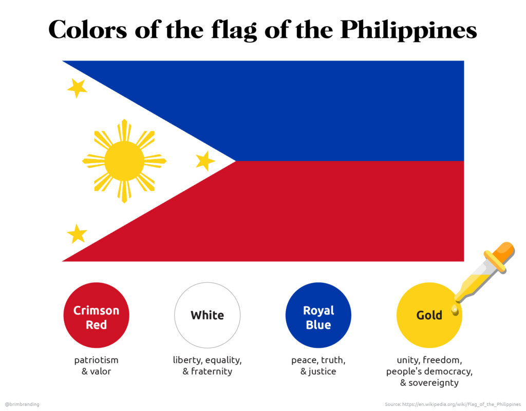
The meanings of each of the colors of the flag of the Philippines are as follows*:
Crimson Red = patriotism & valor
White = liberty, equality, & fraternity
Royal Blue = peace, truth, & justice
Gold = unity, freedom, people’s democracy, & sovereignty
*In the sources I found, it was difficult to tell if the meanings applied to both the element shape and color.

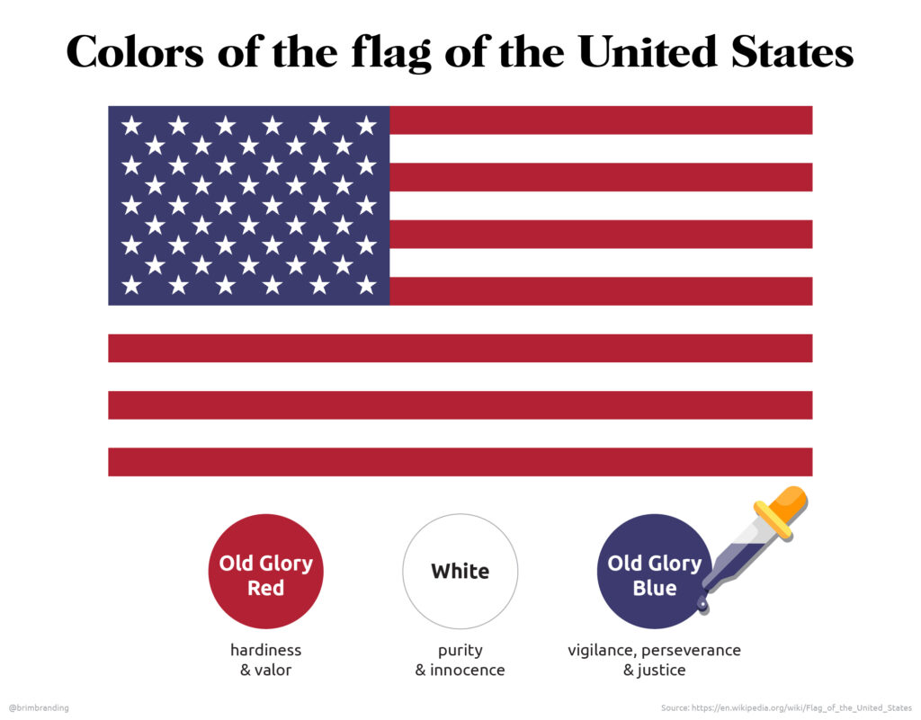
The meanings of each of the colors of the United States flag are as follows**:
Old Glory Red = hardiness & valor
White = purity & innocence
Old Glory Blue = vigilance, perseverance & justice
**Although these meanings are widely accepted, Ronald Reagan gave his own interpretation of the colors in 1986:
Red = courage & readiness to sacrifice
White = pure intentions & high ideals
Blue = vigilance & justice

For some, all of these attributes might be viewed as hyperbolic and theatrical. On the other hand, they could also be viewed as qualities to strive for. Are these attributes who we are, or who we aim to be? Maybe they’re both. And isn’t the purpose of a country’s flag to honor the history of the struggles and triumphs of the past while beaming as a beacon all that we strive to be in the future?
And isn’t the purpose of a country’s flag to honor the history of the struggles and triumphs of the past while beaming as a beacon all that we strive to be in the future?
Either way, the fact that a flag’s colors can spark a discussion on psychology and sweeping abstract concepts indicates their power and impact.
How about you? What do colors in a flag mean for you?


