Case Study: Logo for Congressional Candidate
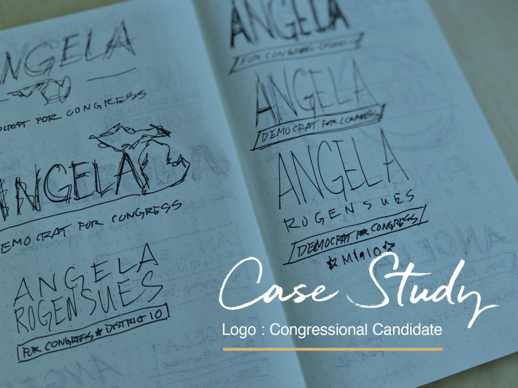
When Angela Rogensues (pronounced “rogue-in-see”) announced her run for the open congressional seat in Michigan’s newly-drawn 10th district in January 2022, her team asked me to design a logo for her campaign. I was thrilled at the prospect of representing a Democratic multi-hyphenate woman.
Angela is a City Councilmember, businesswoman, public servant, and community leader. As a lifelong Michigander who was born and raised in Macomb County, Angela has spent her career uplifting the voices of her constituents, meeting them where they are, and getting things done to make life better.1
Process
- Logo Kickoff Session
We hosted a 1-hour virtual meeting where we reviewed what she wanted her voters to take away from her campaign, her brand attributes, and what makes her unique.
- Research
Given that Angela is the president of her own marketing firm, this wasn’t her first experience with branding, so it was Brim’s job to immerse ourselves with all of her past messaging and biographies in order to take stock of where she’s been. That way, we could set sights on where she’s going and how her new messaging would translate visually to a voting public who are just hearing about Angela for the first time.
- Logo design
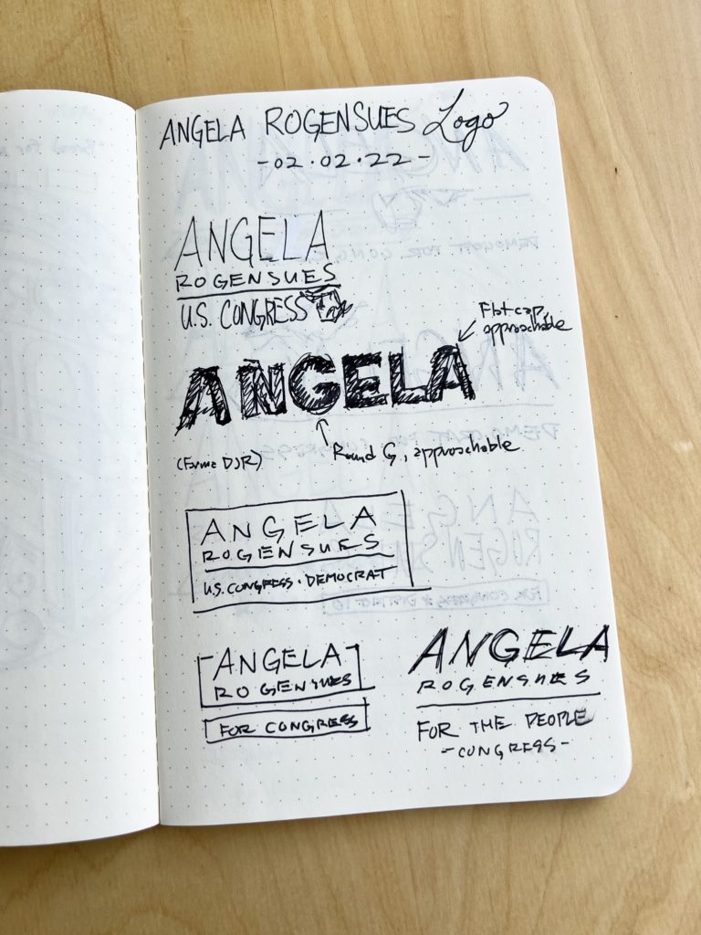
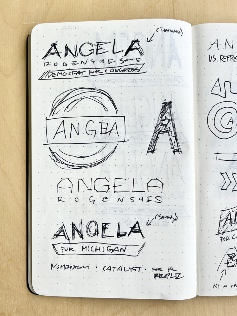
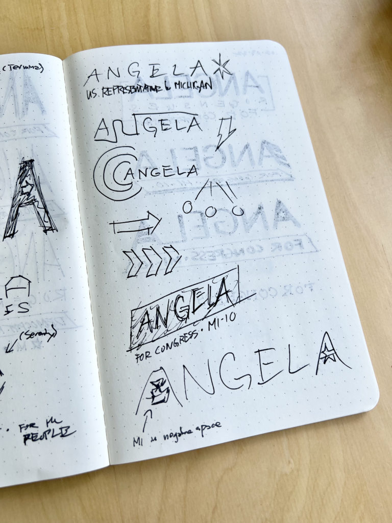
Building on discoveries from our kickoff session and research, we transitioned to the logo design process. We presented 5 options for her and her team to review. From there, they selected 2 favorites with some edits. Then we moved to finalize their approved final logo design and get it campaign-ready!
- Style Guide
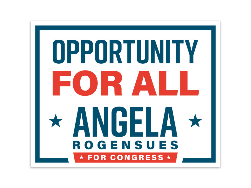
We created a style guide for Angela’s team so that her branding would remain consistent throughout her printed and digital communication pieces. The style guide included logo usage guides, color palettes, and mockups of posters, buttons, and merch.
Discoveries
This isn’t our first political logo, but it IS our first congressional campaign logo. You can imagine that holds a different weight of responsibility. It’s vital to portray the candidate in a way so that voters can pick up on their affiliated party and values while also staying true to the candidate’s messaging and personality.
And there’s definitely pressure! We’ve all seen our fair share of campaign logos that miss the mark. The last thing we wanted to see from this, besides an unhappy client, is our logo on a “Worst Political Logos” blog post.
Here’s are some takeaways in case you find yourself in a political branding campaign as the branding expert or a client:
1.) There’s a massive database of political campaign logos!
Huge thanks to The Center for American Politics and Design for making this possible. All of our research was right at our fingertips thanks to their research. On CAPD’s website, you’re able to filter search results according to color, typography, state, party, and even the graphics and symbols used in the logos.
2.) Alexandria Ocasio-Cortez changed the game.
After her successful run with a bold and energetic campaign that redefined what branding for a congressional candidate can look like, every political branding project we’ve been a part of has brought up AOC’s campaign and branding as a barometer. (“Are we less AOC or more AOC?”) And if you look at political logos released after AOC’s campaign, you can see a notable shift in logo design trends.
3.) Selecting the perfect red and blue colors is essential.
If you choose to use red and blue in your color palette, selecting the right kind of red and blue is essential in subtle messaging and affiliation. For example, using more classic reds and blues signals a more conservative or centrist candidate. Using a tint, tone, or shade of those colors tends to signal a more progressive candidate.
And if you’re using any non-traditional colors, be hyper-aware of the subconscious correlations and connotation that may bring up for voters. For example using the color green may signal that the candidate is part of the Green Party. Or perhaps that the candidate is fiscally-focused. (Note: Democratic candidate Al Green, who is now serving as a representative in Texas’s 9th district, wisely leveraged his last name and used the color green in his logo. It would’ve been cognitively dissonant to have “GREEN” in a red or blue color.)
4.) Consider other information you want to convey in the logo.
Effective logos use minimal real estate, so you must decide whether you also want to include the following information, besides the candidate’s name:
- Party affiliation
- District number (if the candidate is running for the House of Representatives)
- State
- “Congress” or “For Congress” or “U.S. Congress” or “Senate” or “U.S. Senate”
Results
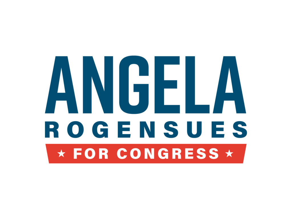
The final result is a logo that portrays Angela Rogensues as an empathetic, steadfast, and mission-driven public servant. Three months after her official campaign launch, Angela is one of the top two democratic fundraisers.

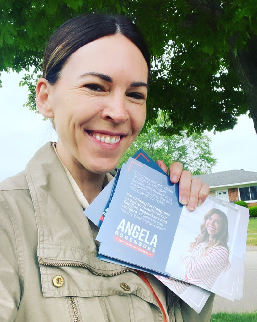
I’m so honored to have had this opportunity to help a woman like Angela break through her glass ceiling and amplify the voices of her constituents.
To learn more about Angela Rogensues, visit her website here.
Reference:
1 https://actionnetwork.org/groups/angela-rogensues-for-congress
